

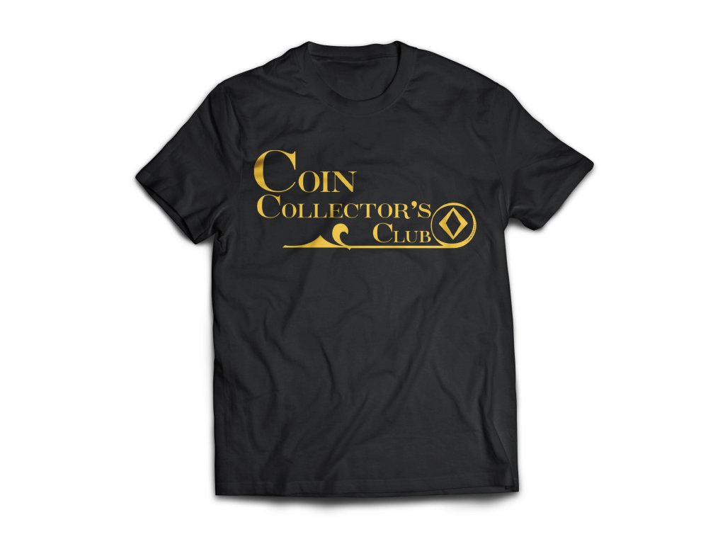
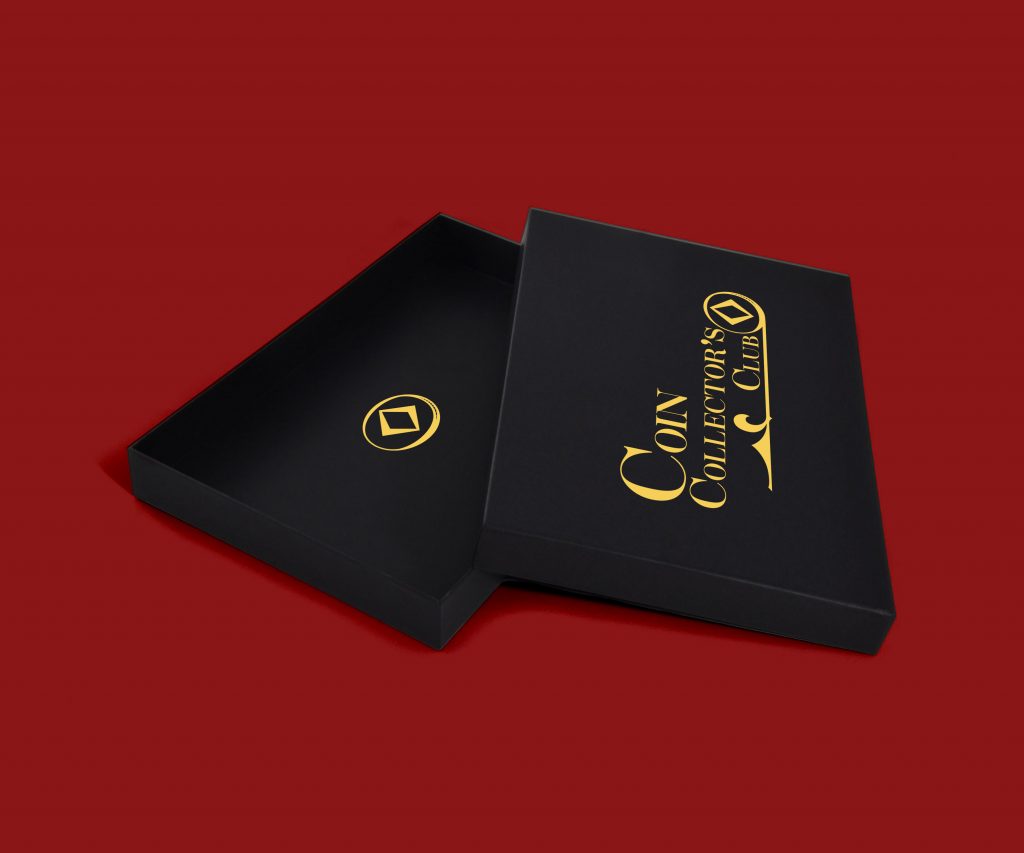
Coin Collector’s Club was a logo that came together rather organically. I knew typography was going to be the solution but wanted something that felt classical and clean.
The chosen solution was a vivid typeface supported by brand elements taken from the typeface itself. Coin Collector’s Club is for collector’s and those who appreciate history. This typeface calls on classical typefaces such as Garamond and Caslon. The high contrast forms almost being reminiscent of coin silhouettes.