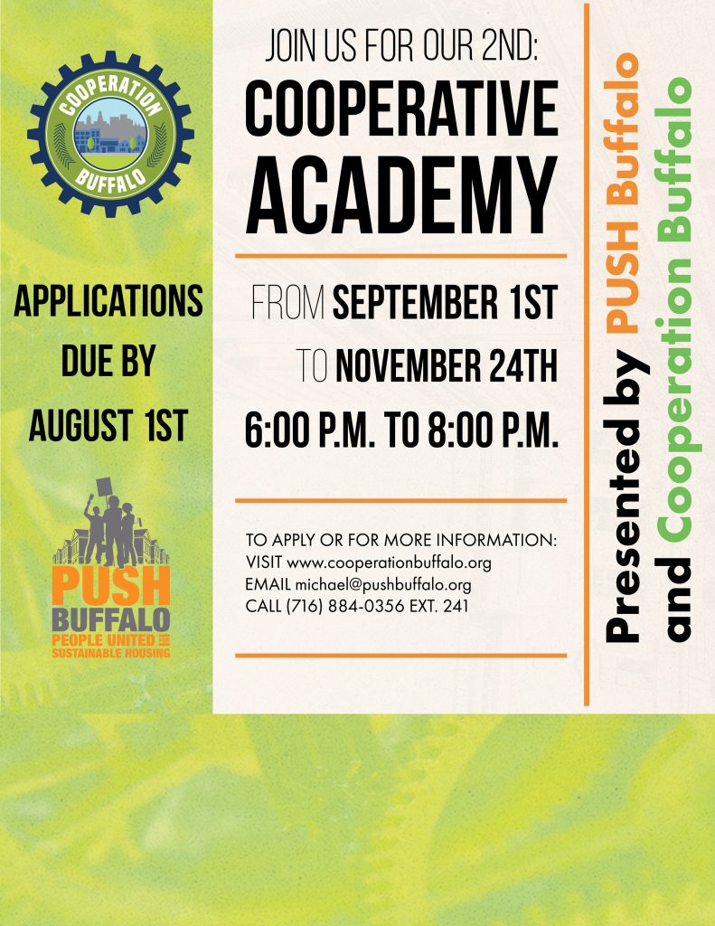
Cooperation Buffalo is a community-led resource center, a team of cooperative business developers and educators. I’ve had the pleasure of working with them for a few years now. Over that time we’ve developed a strong visual language that features bold typography and never lacks for that sense of fun. I have done branding and photography for Cooperation Buffalo.
Chief among materials made for Cooperation Buffalo was their style guide. Cooperation Buffalo had a preexisting brand identity but it was their hope was to expand it to beyond logo versions but dictate things such as color and typeface usage.
Born directly from this was their 2023 Style guide. It features assets produced via the style guide and follows along with the newly established approach of Cooperation Buffalo, bold color palettes and a simplified presentation of complex financials.
These campaigns display Cooperation Buffalo’s more colorful and playful side. Photography is by myself and campaign lockups were made by me as well.


